Trend Spotting - Butter Yellow: 5 Creative Ways to Bring Yellow into Your Interior
Meet Butter Yellow - the latest color sensation flooding interiors worldwide. This cheerful, uplifting color first started to appear in our wardrobes and has slowly crept its way into our entire homes. With a spectrum of tones that fall under the butter yellow trend from calming off-white hues to richer, more energizing cornflower-inspired shades, it’s easy to see its versatility and why it adapts so effortlessly to any space and personal style. What’s more, butter yellow is a wonderfully adaptable and gender-neutral color that we’ve seen pop up in countless nurseries, playrooms, bedrooms and kitchens.
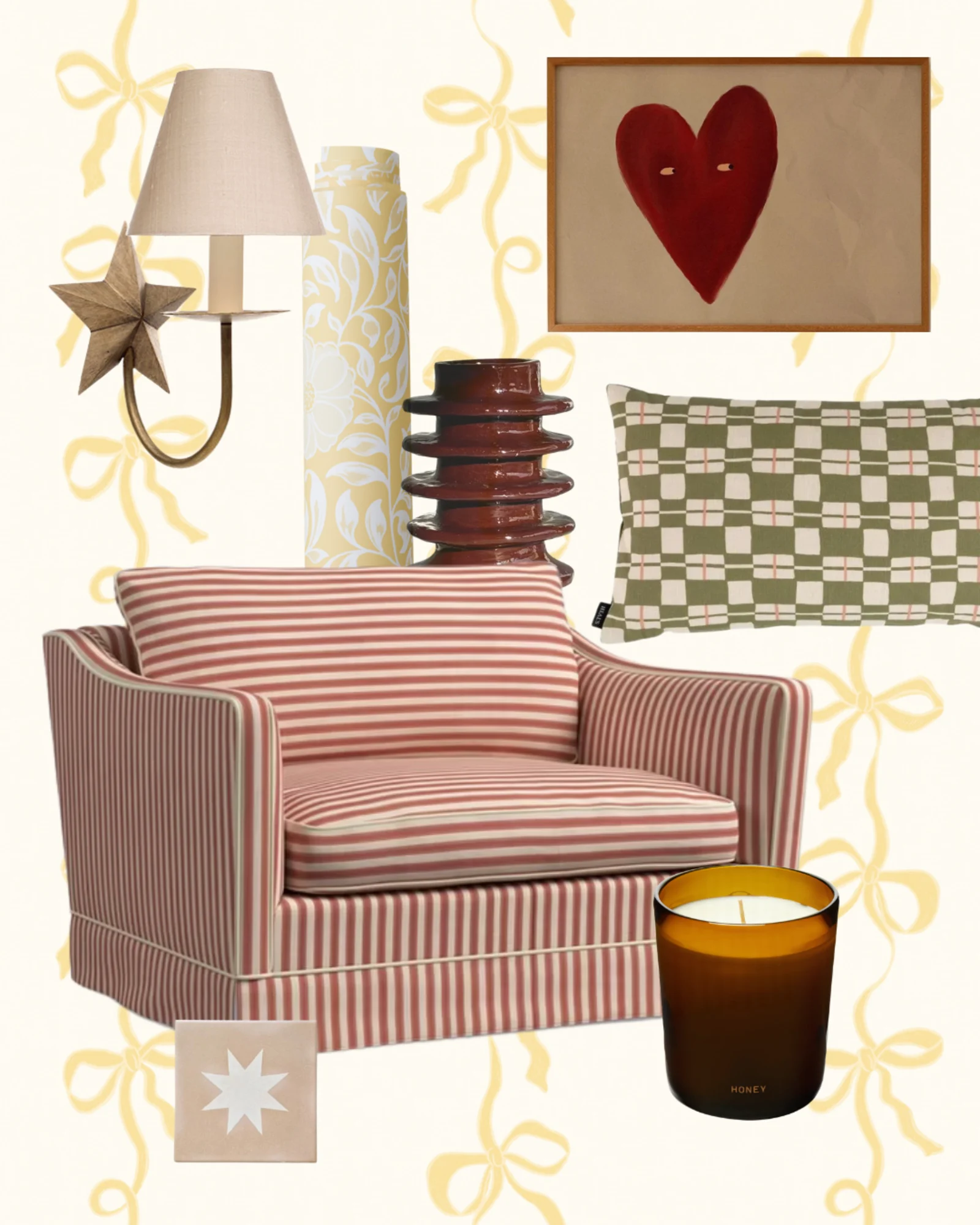
Image Credit - byKhay (Etsy)
5 Creative Ways to Bring Yellow into Your Interior Decor
It’s easy to see why the Butter Yellow trend has grown so rapidly and why we can’t get enough of it on an aesthetic level. But when we take a closer look at the benefits of a yellow environment, it offers the extra confirmation we need to know this trend goes far deeper than simply keeping your interior stylish and on-trend. Incorporating yellow into a space is said to boost feelings of happiness, optimism, and confidence. Psychological research suggests that the human brain associates yellow with sunshine and warmth – two things we all enjoy.
With that being said, you might now know that you love the look of the butter yellow trend, and you’d love to enjoy some of the sunshiny benefits of featuring this color in your home too. But perhaps you’re struggling to figure out how to incorporate it and which approach works best for you and your space? Let us introduce you to five easy decorating techniques you can use to inject some buttery yellow goodness into your home.
1. Finding the right yellow for your space
The first step we recommend when starting to redecorate a space is to take a good look at what you already have. How big is the room? How much natural light does it get? What is the space used for? And what’s your overall vision for how you want it to look? All of these factors should help guide your decision when choosing the right shade from the butter yellow trend.
For example, if the room you’re decorating doesn’t get much natural light and tends to feel quite dark, you might want to opt for a cooler-toned yellow. This can help make the space feel brighter and more open.
It’s easy to get a little lost in the terminology when it comes to the finer details of color. So here’s a quick breakdown of the terms shade, tint, and tone, which can be helpful when explaining your ideas to DIY stores or designers:
Shade
When black is mixed into a color, it deepens the original hue, resulting in a shade that's richer and more intense. These darker versions can feel bold and dramatic, and in some cases, a little overpowering if not balanced well.
Tint
Adding white to a color softens it, creating a lighter, gentler version known as a tint. Tints can help tone down vibrant colors and are perfect for creating a more delicate, airy feel in a palette.
Tone
A tone is created by blending gray (a mix of black and white) into a base color. This process mutes the intensity and adds depth, revealing more subtle and complex qualities within the original hue. Tones aren’t as bright as tints, but they avoid the pastel look and offer a more grounded feel.
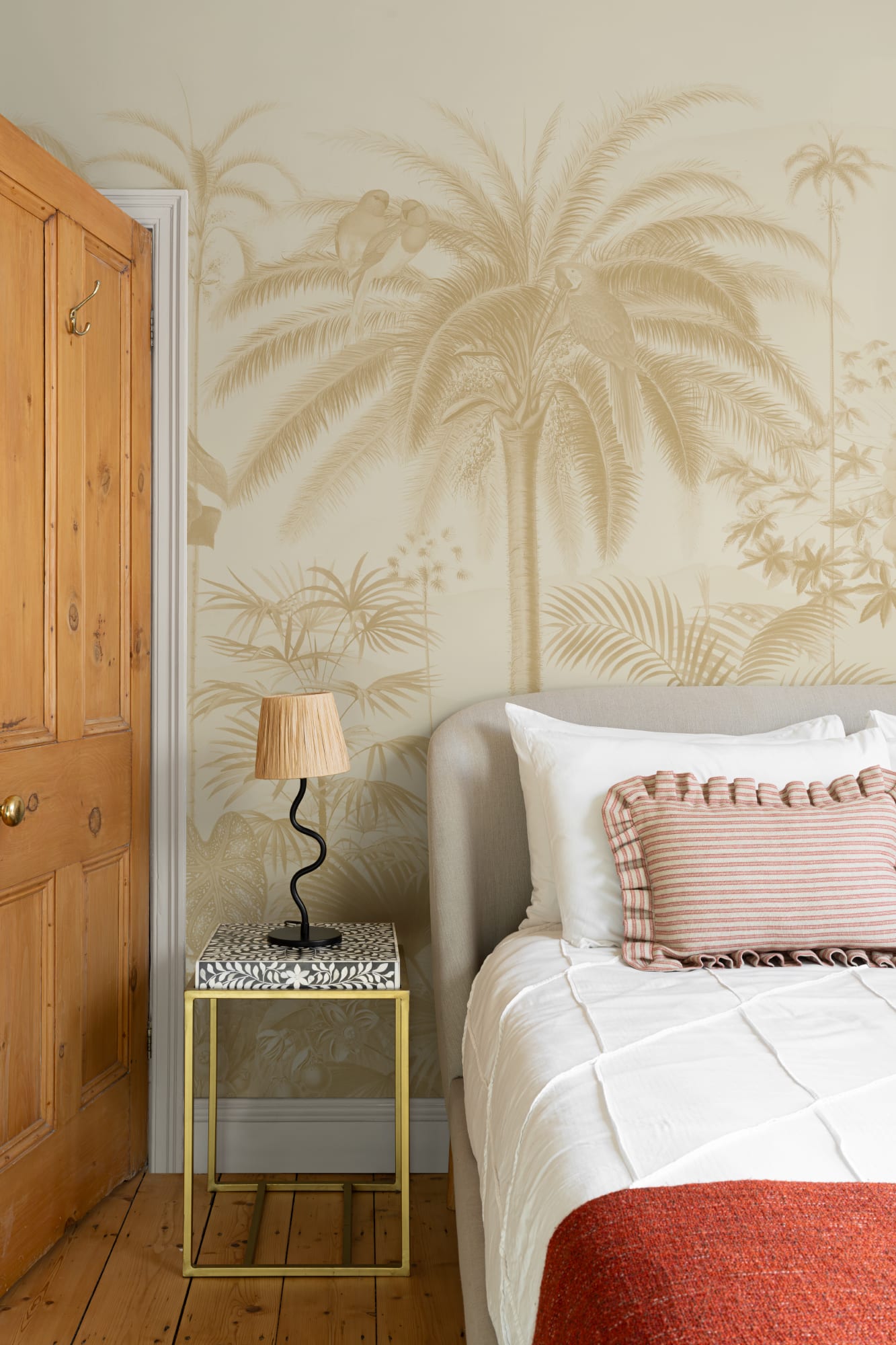
Yellow Illustrated Tropical Botanical Mural
2. Complimentary color matches
This next technique has been used for centuries to create cohesive interiors – complementary color matching. Once you’ve taken into account your space, its size, purpose, and how much natural light it receives, the next step is to decide whether the colors you plan to pair with this trending shade will complement it effectively.
The easiest way to determine which colors work together is by referring to the color wheel. Here’s how: find the shade of yellow you’ve chosen on the color wheel and look directly opposite. The colors opposite each other are complementary and will naturally create an aesthetically pleasing space.
Some complementary combinations we recommend include yellow and green, yellow and white, yellow and navy, and yellow and pink. Have a play around by ordering samples of our designs and comparing them with materials and paint swatches to see which combinations work best for you. Our Pencil Yellow design is an excellent example of one of our complementary color suggestions: pink and yellow.
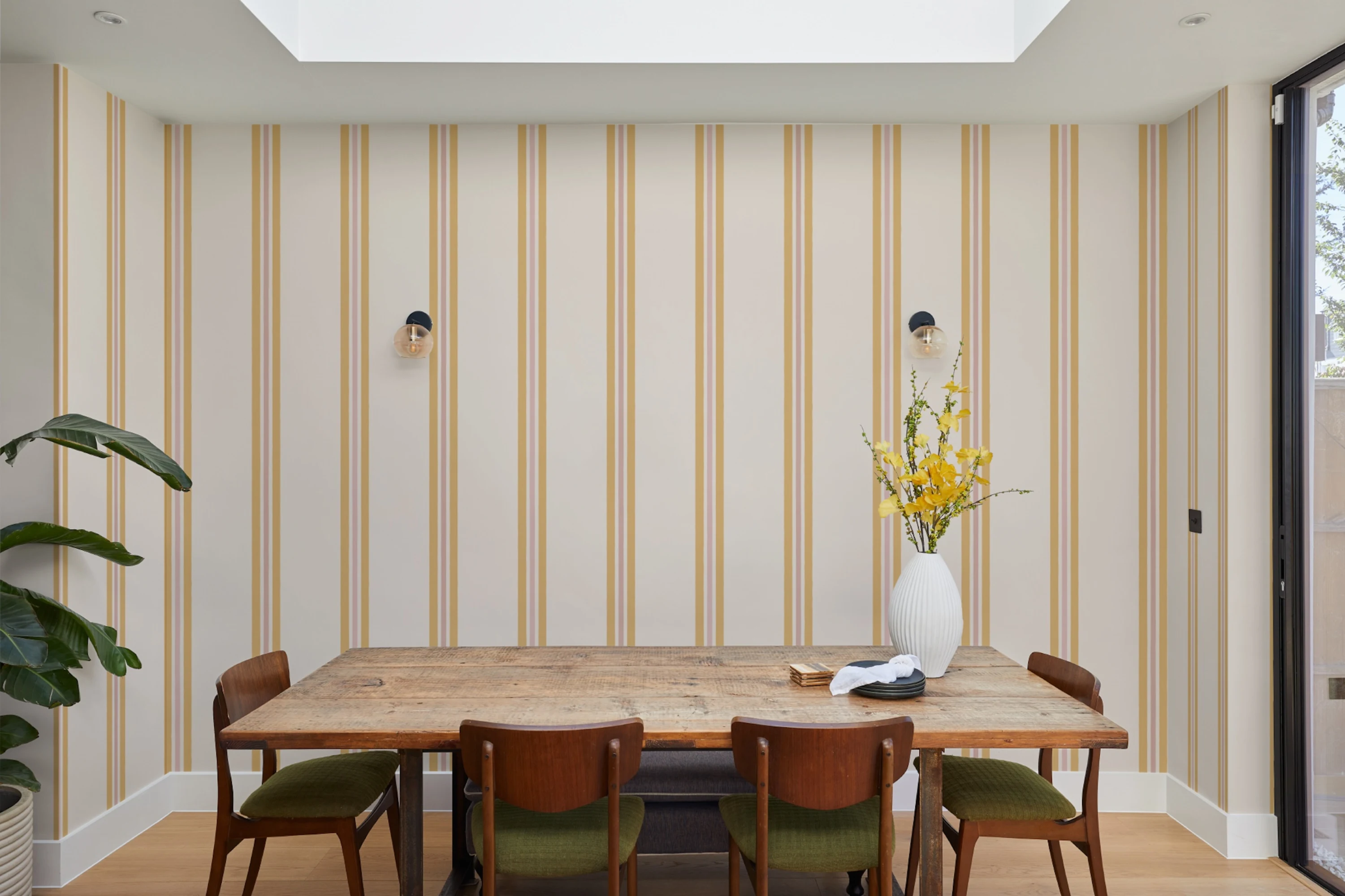
Yellow Contrast Pencil Stripes Wallpaper
3. Double Drenching
The Double Drenching design technique has been growing in popularity recently, much like the butter yellow trend, so it’s no surprise that we’ve seen the two come together to create some truly beautiful spaces. Double Drenching involves using two or more related colors and saturating the entire room in them. These colors can vary in shade, tint, and tone to create a subtle yet elegant contrast.
This trend is perfect for showcasing your favorite color, while still ensuring that key features in the room stand out by highlighting them in a slightly different variation of the same hue.
4. Color drenching
Color drenching is an interior design trend that involves styling a space entirely in a single color. Whether it’s an entire kitchen with butter yellow cabinets or a single wallpaper design, like our Aviary Tropics Yellow, wrapping around an entire room, color drenching your space creates an immersive and bold statement.
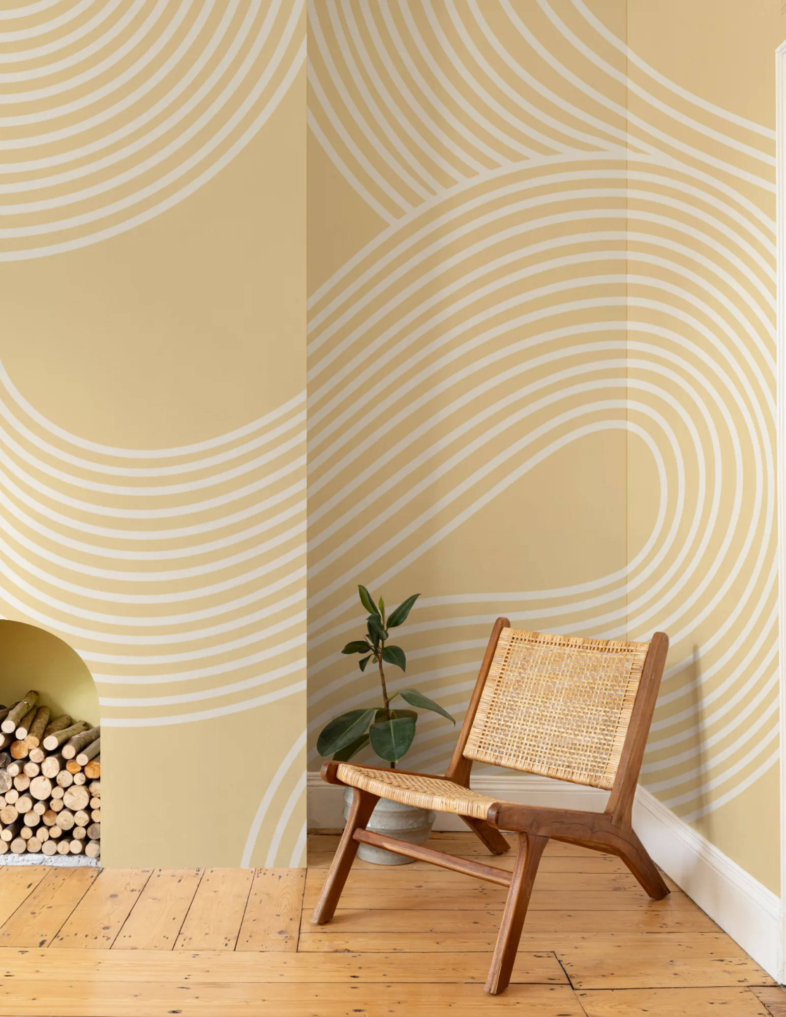
Yellow Curvy Lines Modern Zen Garden Mural
5. The power of yellow details
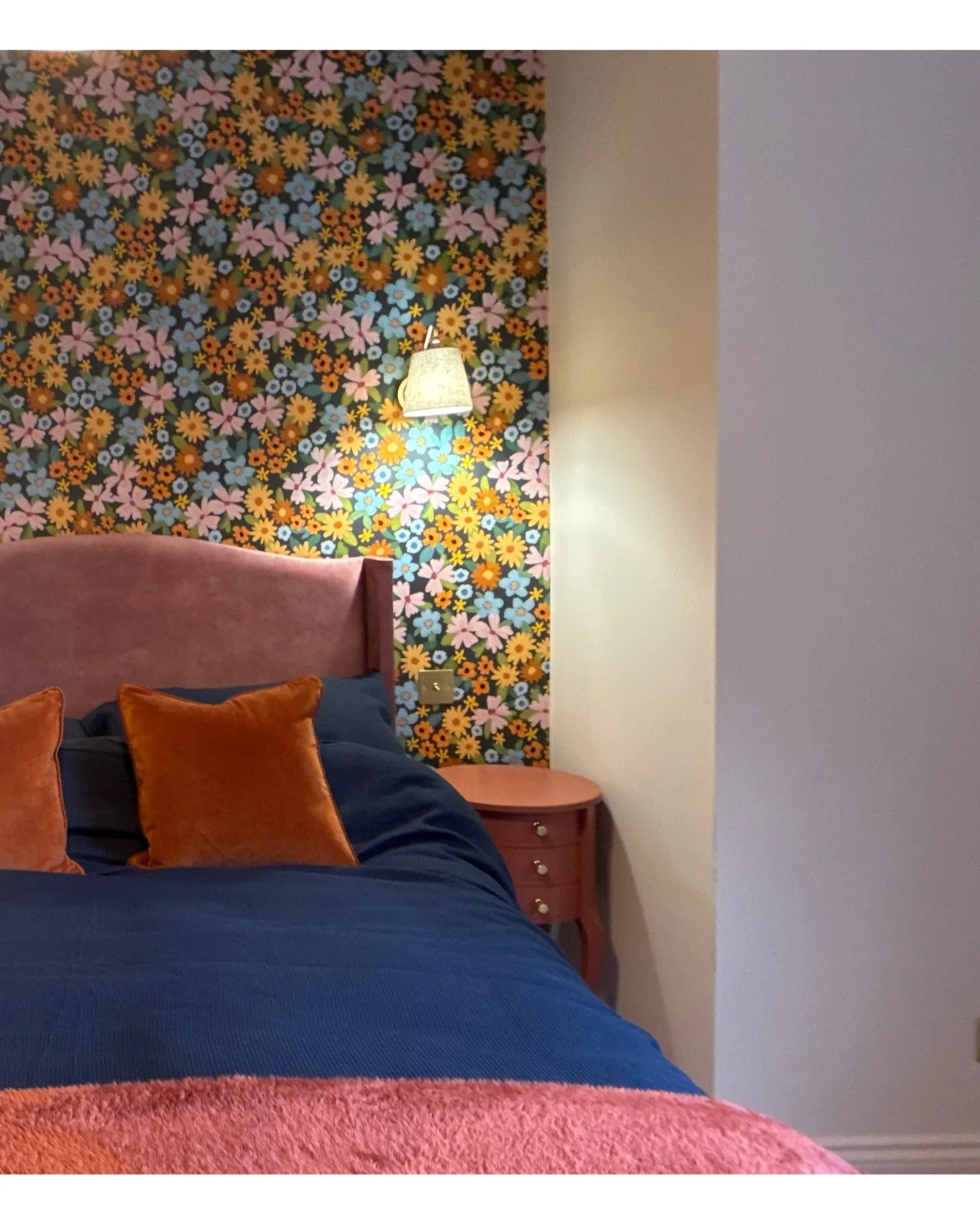
This design technique is perfect for those who want to embrace the trend in a more subtle way. If a more neutral palette suits your personal taste or you’re aiming to create a minimalistic, calming space, you can still participate in the butter yellow trend by incorporating it through furniture, accessories, accents, and details. If color drenching an entire room in this sunny yellow feels too bold, consider adding smaller yellow accents. For example, take inspiration from @daisyandlilshome's spare bedroom, where they’ve incorporated the butter yellow trend through the Dorothy Navy design, featuring a beautiful floral print. The subtle touch of yellow in the floral pattern adds a hint of sunshine to the space.
If you decide to use this technique, we recommend pairing a design like this with additional yellow accessories and furniture to enhance the color throughout the room, our Butter Yellow mood board on Pinterest has even more ideas and wider inspiration on this.
Bright Multicolor Playful Floral Print Wallpaper